Date: July 23rd, 2009
Author: Debra Littlejohn Shinder , sourced from TechRepublic.com
With the release of the Office 2010 Technical Preview, details are finally starting to roll in. Deb Shinder highlights some of the features she thinks might make the new version worth the upgrade.
Microsoft kept the details of its next iteration of Office pretty closely guarded up until the release of the Technical Preview in conjunction with the opening of the Worldwide Partner Conference (WPC) July 13th Now, with the software in the hands of thousands of Microsoft partners, MVPs, and other “selected testers,” the cat is out of the bag. I was told by my MVP lead at Microsoft to blog about it to my heart’s content.
My first impression was that Office 2010 is going to be to Office 2007 what Windows 7 is to Vista. Although personally I liked both of them, Vista and Office 2007 inspired an inordinate number of complaints from consumers and IT folks alike. Maybe the changes were a little too drastic or maybe it’s just that the timing wasn’t right. Whatever the reasons, many people skipped the new OS and apps and stuck with Office 2003 on XP.
After using Office 2010 extensively for the last couple of weeks, I’m finding more and more to like about it. One big change is that this version of Office comes in a 64-bit version, so those running a 64-bit OS can take full advantage of 64-bit performance and stability. Keeping in mind that this is beta software and some things could change before the final release, here are the top 10 features that I think will make Office 2010 worth the upgrade.
Note: This article is also available as a PDF download and as a photo gallery.
1: The Ribbon
Why would I list the Ribbon as the number one new feature in Office 2010, when the Ribbon was introduced in Office 2007 — and in fact, was the feature that caused the most controversy? Although some of us loved the new Ribbon interface, many others hated it, so much so that third-party developers soon devised programs to restore the old familiar menus. An example is Classic Menu from Addintools.
Office 2010 not only keeps the Ribbon; it has now been added to all the Office programs, including Outlook and OneNote. But don’t panic: The Office 2010 implementation is Ribbon Done Right. The difference is that now you have control over your Ribbon and what items appear on its tabs, and you can even add tabs of your own and put your favorite commands on there. No more despair because a favorite command that was on an Outlook 2003 menu can’t be found anywhere on the Ribbon.
All you have to do is right-click the Ribbon and select Customize The Ribbon. This opens a dialog box from which you can make new Ribbon tabs and add or remove commands from the tabs, as shown in Figure A.
Figure A
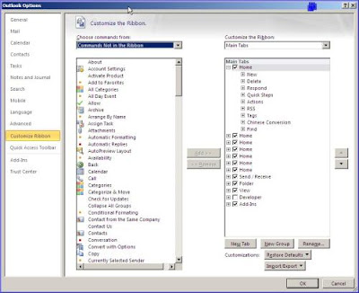
The Ribbon in Office 2010 applications is completely customizable.
2: Office button options
Office 2007 users are familiar with the Office button, the big round button in the upper-left corner of Office applications, from which you can select a variety of tasks and options. Figure B shows the Word 2007 Office menu.
Figure B
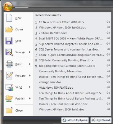
The Office button in Office 2007 provided a number of options.
The Office button in Office 2010 has a new look, and it’s been added to Outlook and OneNote, which didn’t have it before. Figure C shows what you see when you click the Office button (now implemented as a Ribbon tab) in Word 2010.
Figure C
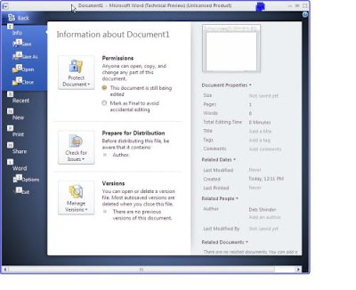
The new Office menu has a whole new look and layout.
You’ll find many of the same options as before, along with a number of new ones. For example, in the Sharing section, you’ll now see options to save the document to SharePoint or change the file type, as you can see in Figure D. The Back button at the top of the page returns you to the document itself.
Figure D
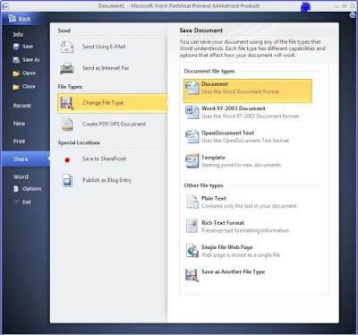
You’ll discover some new options on the menus.
3: Outlook improvements
Outlook is the Microsoft Office program I use most often. It’s the first application I fire up when I sit down at the computer in the morning and it’s the last application I close when I shut down for the night. And I’m checking my mail and calendar and looking up contacts every 15 minutes (or more often) throughout the day. This makes changes to the Outlook interface very important to me — I want it to work better, but I don’t want to have to relearn everything and I don’t want to lose functionality.
The Ignore button that’s been added to Outlook is just what those of us who belong to lots of email discussion lists have been waiting for. It allows you to get rid of conversation threads that you aren’t interested in. Not only will it delete all messages in your Inbox that belong to the thread, but it will automatically delete any messages pertaining to that thread that come in later. Highlighting a message and clicking the Ignore button displays the dialog box shown in
Figure E.
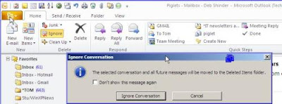
The new Ignore button in Outlook makes it easy to bypass entire conversation threads.
Outlook 2010 also makes it easier to manage conversations. When you view messages in Conversation View, you can right-click a conversation title and select from a number of actions that you can perform, as shown in Figure F. If you select Clean Up Conversation, redundant messages in the conversation will be deleted.
Figure F

You can perform more actions on a conversational thread, including clean up.
Another great new Outlook feature is Quick Steps. This is a section on the Ribbon’s Home tab where you can create single-click links to perform tasks that normally require multiple steps. For example, if I want to forward a message to my husband, instead of clicking forward and then typing his address into the To box, I just click the To Tom link and the forwarded message appears with his address already entered. Figure G shows the Home tab of the Ribbon with the
Quick Steps section highlighted.
Figure G

The Quick Steps section of the Ribbon lets you perform multi-step tasks with one click.
4: Easier screenshots
If you’re a tech writer, you’ll appreciate a new feature in Word 2010 — the ability to capture screenshots from inside the application and paste them into the document, all in a couple of clicks. The Screenshot button has been added to the Insert tab of the Ribbon, as shown in Figure H.
Figure H

Inserting screenshots into Word is easier than ever.
When you click the Screenshot button, you’ll see the available screenshots, and you can click on the one you want to insert into the document. After you insert a screenshot, the picture tools will automatically appear to allow you to perform photo editing.
5: Photo/video/graphics in Word and PowerPoint
The photo-editing tools have gotten more sophisticated in Office 2010. Now you can apply artistic effects, similar to those available in third-party photo editing programs, such as PhotoShop, from within Word, Excel, and PowerPoint. You even get a thumbnail preview of what the effect will look like when applied to your picture, as shown in Figure I.
Figure I
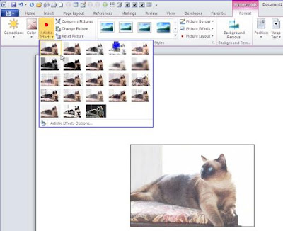
You can now apply artistic effects to photos from within Office programs.
In PowerPoint, you can apply artistic effects, reflections, shadows, etc., to both photos and videos, as shown in Figure J.
Figure J
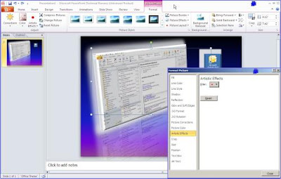
You can apply artistic effects to pictures and video in PowerPoint 2010.
The Office 2010 applications also include several new SmartArt designs, to make it more likely that you’ll find one that fits the needs of your document or slide, as shown in Figure K.
Figure K
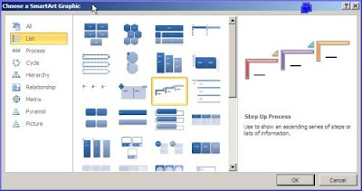
Office 2010 includes a number of new SmartArt designs.
6: Drag-and-drop navigation pane
One of my favorite features in Word 2010 is the new drag-and-drop navigation pane. It’s a little like the Word 2007 document map — on steroids. Whereas the document map only gives you a view of your headers and document sections, graphics, etc., the navigation pane lets you rearrange your document easily by dragging and dropping within the pane. To turn on this feature, click the View tab on the Ribbon and in the Show section, check the box labeled Navigation Pane, as shown in Figure L.
Figure L

Go to the View tab to display the new drag-and-drop navigation pane.
Want to move that third first-level heading (and all the text under it) up above the second one, without having to copy and paste it? No problem: Just drag the heading where you want it in the navigation pane, which displays to the left of your document, as shown in Figure M.
Figure M
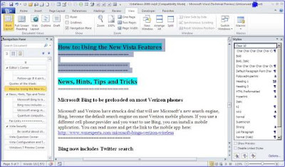
You can move whole sections of text by dragging and dropping the headings in the navigation pane.
7: Open in Protected View
When you open an existing document for the first time in Word 2010, if you try to start editing it, you may be surprised to find that nothing happens. If you look more closely, you’ll see that the Ribbon is hidden. What’s up with that? The document has opened in Protected View, as shown in Figure N.
Figure N
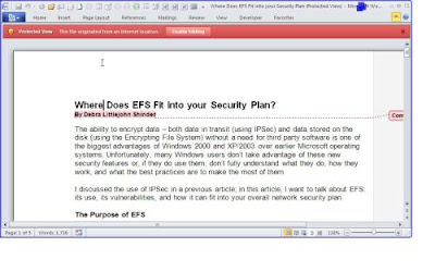
The first time you open a document in Word 2010, it opens in Protected View.
As you can see, a red box across the top of the document notifies you that you’re in Protected View and tells you that the file originated from an Internet location. This gives you the opportunity to determine whether it’s safe to open. If you click the Enable Editing button, the document downloads, the Ribbon appears, and you can make changes to the document as usual.
8: Excel sparklines and slicers
The most notable additions to Excel 2010 are two new features called sparklines and slicers. Sparklines are tiny charts that fit into a cell, as shown in Figure O.
Figure O

Sparklines are charts that fit into a cell on an Excel spreadsheet.
The sparklines shown in the figure use the line format, but you can also create column or win/loss sparklines. You can edit the design of the sparklines, too, as shown in Figure P.
Figure P

You can edit the design of your sparklines.
Slicers are objects you can use to filter the data in pivot tables, which you can move around or resize on the screen. When data in the pivot table changes, the slicer is automatically updated. Both sparklines and slicers are created via the Insert tab on the Ribbon, as shown in Figure Q.
Figure Q

You create sparklines and slicers via the Insert tab on the Ribbon.
To see a demo of the new Excel features, check out the video at http://www.microsoft.com/office/2010/
9: OneNote improvements
OneNote has been a bit of a forgotten stepchild in previous editions of Office, perhaps because it only came with the “lowest” and “highest” editions of Office 2007 — Home and Student edition and Ultimate edition. Most Office users have the Standard, Small Business, or Professional edition. Microsoft obviously wants to get more exposure for OneNote. According to early reports, Office 2010 features will follow the same pattern as Windows 7; that is, each successively more expensive edition will contain all the applications of those editions “below” it, and more. That means OneNote will be included in all editions of Office 2010.
The most obvious change to OneNote, as with Outlook, is that now it sports the Ribbon interface, as shown in Figure R.
Figure R
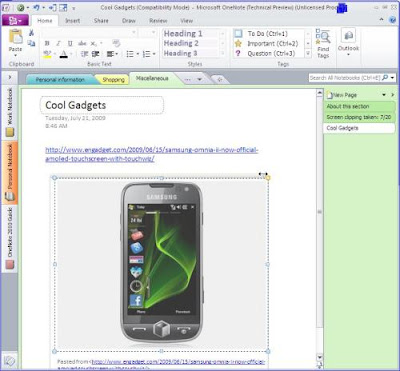
OneNote, like its Office-mates, now sports the Ribbon interface.
In OneNote, however, the Ribbon is minimized by default. Just click the small arrow near the Help icon (blue question mark) in the upper-right part of the window to maximize it.
The new OneNote includes a number of improvements to simultaneous multiple-user editing of notebooks. New content that was added (or changed) by another user is now highlighted, so you immediately see what’s new. There is also color coding to indicate the author of content that was written by someone else. Searching has been enhanced, as well.
Another interesting feature is linked note taking. If you put OneNote in linked mode, it will automatically link your notes to whatever you’re viewing (Web page, selection in Word, a particular slide in a PowerPoint presentation, etc.). Then, when you hover over the link in OneNote, you see a thumbnail of the material to which it’s linked and you can click it to open the original.
For editing, OneNote now supports basic styles. You can also add math equations, and there is a miniature translator that provides a tooltip in your language if you hover over a foreign word. Finally, on Tablets and other touchscreen PCs, OneNote supports touch gestures, such as finger scrolling and panning and pinch zoom.
10: Simultaneous editing
Here is another favorite of mine. I often leave a document that I’m working on open on one computer, and then need to open and work on it from a different computer. I get the familiar “file in use” dialog box that gives me the option to open a read-only copy, create a local copy to merge later, or receive notification when the original is available. Office 2010 does away with that annoyance.
Now I can pick up where I left off, or two people can edit a document simultaneously. A notification in the status bar tells you who else is currently editing the document, and where they’re making changes. Very cool!
Word can also cache shared documents so you can edit them when you’re offline, and any changes you make will automatically be synchronized with the original on the server when you come back online. Now you don’t have to remember to merge your document when you get back.
Summary
Office 2010 still has to go through a public beta (expected later this year) before we see it in its final version, but what we’re seeing in the technical preview looks promising. Whether you’re using Office 2007 or you’re still using Office 2003, Office 2010 will offer enough new and improved features and functionality to make it worth considering the upgrade.